I’m Sandra, Head of Product Design at Equals, and I want to let you know about significant visual and usability upgrades coming soon to our platform.
Thanks to feedback from our valued customers, the refreshed platform will help finance teams manage money more easily, improve accessibility for everyone, and allow us to bring you more features in the future.
To learn more about why we're doing this, what to expect, and for insights on specific updates, please use the navigational links below:
As we've added new features, we realised our platform needed a refreshed design and structure. We want customers to reach the right screens quickly and easily find the key information they need to do their jobs. The experience should feel instantly familiar and intuitive for everyone who uses the platform.
Here’s a preview of the key improvements you can expect across the refreshed platform:A fresh look and feel - You’ll soon see updated colours, icons, and styling across the platform.
The new experience will roll out in phases from summer 2025 through to the end of the year. You’ll see updated illustrations first, followed by a new navigation and Overview page. On this blog, you’ll find updates below that highlight what’s changed.
We want our platform to keep evolving based on feedback from our customers. When the new design reaches you, please let us know what you like and what could be improved. You might see requests for feedback within the platform, and you can always share your thoughts with our support team or your account manager.
Please note: none of these updates will affect your ability to use any existing features.
Thank you for choosing Equals. We hope the refreshed platform saves you time and helps you in your everyday work. Enjoy the upcoming changes — and watch this space for more updates.
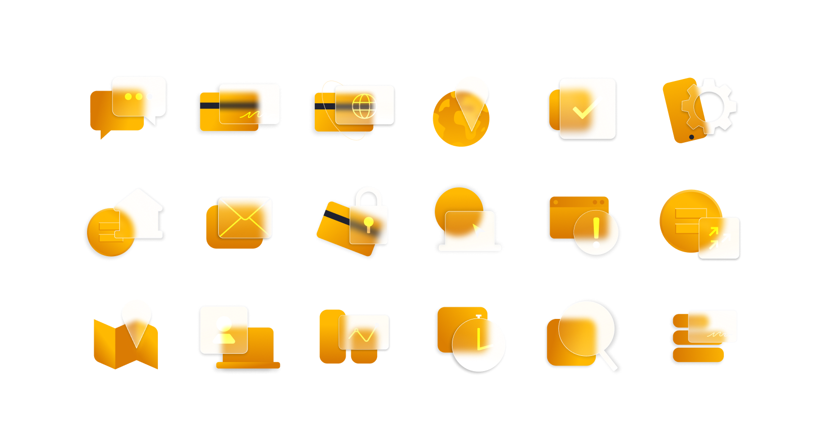
We've just made our first update as part of this project, and you may have noticed a new set of illustrations has landed. These modern visuals are designed to help you navigate your tasks with ease.
For our white label customers, these illustrations can now be customised to align seamlessly with your chosen branding. Previously, our visuals featured Equals’s distinctive mango colour scheme. With this update, illustrations will dynamically reflect your primary brand colour, making the platform feel uniquely yours.
This allows us to offer your customers a cohesive, consistent experience across the entire platform — enhancing usability and reinforcing your brand identity.
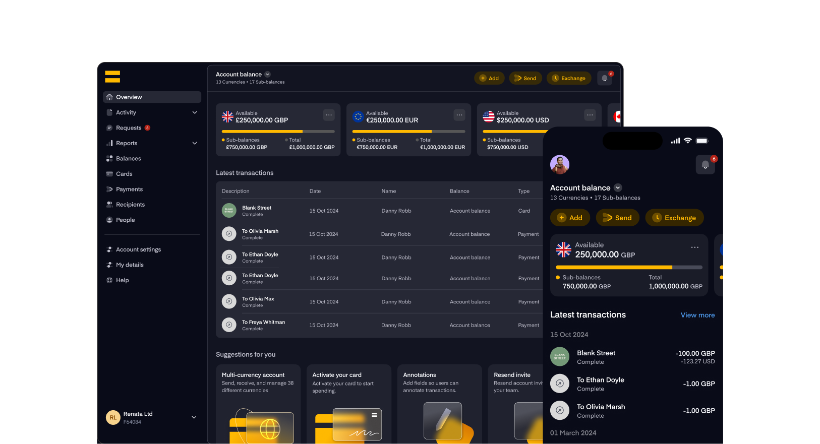
We’ve made it easier to find your way around. The new navigation replaces the old top and left menus with one clean, streamlined menu on the left-hand side. Everything you need is now in one place, so you can access key features and tools faster.
Whether you're managing users or reviewing payments, the updated layout is designed to be more intuitive — helping you spend less time searching and more time getting things done.
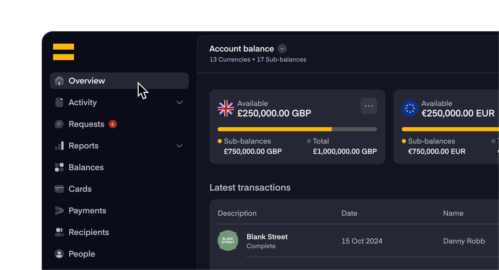
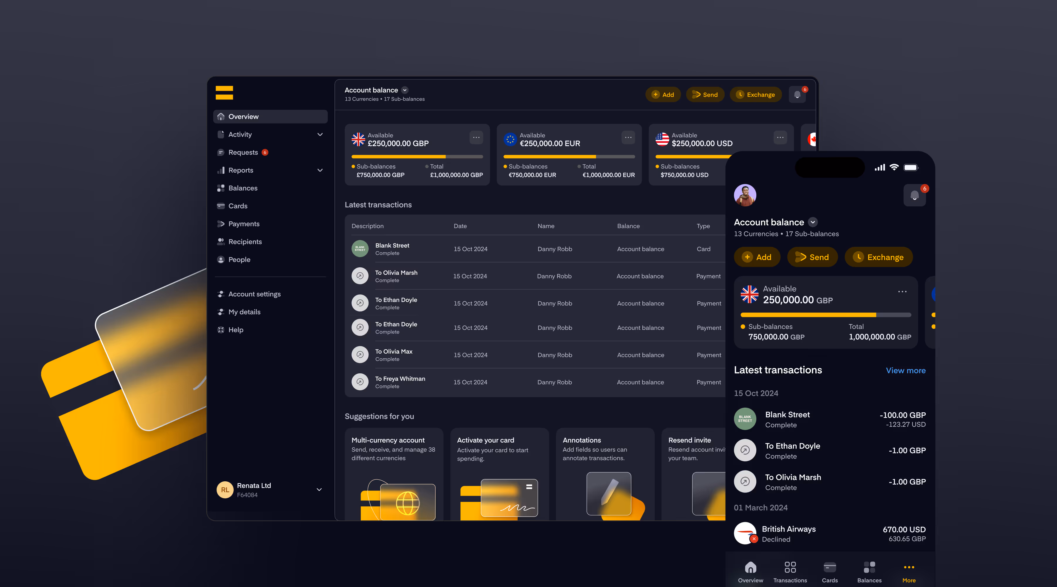
In October, we brought the refreshed design to the Overview page. As it's the first page you see, it was important for us to make it as helpful as possible. The new page is cleaner, more accessible, and designed to give you a clearer snapshot the most important parts of your account at a glance.
In the future, we're planning to introduce a Balances selector on the Overview page. This will give you quick access to view all the funds available across every Balance you have access to. We also plan to enable cardholders to view their balance(s) on the Overview page.
As part of the update to the Overview page, we've removed the old "Needs attention" section. To replace it, we've introduced a new Notifications area, designed to make it easier to stay on top of actions that need your attention such as approving payments or accepting funds requests.

We've given the Transactions page a refresh based on how customers actually use it. It looks cleaner and feels more organised from the moment you land on it. Rows and data are easier to scan, helping finance teams spot what matters without distraction. Filtering activity is now much smoother too, with filters applied directly on the page rather than in a separate window. These changes are all about helping you get insights faster and with less effort, so reviewing spend and payments feels like a natural part of your workflow.
.png)
We've updated the Cards view to make managing and controlling your cards easier. Your cards are now organised into clear "My Cards" and "Shared Cards" tabs, and tapping into a card opens a redesigned details panel showing balances, spending limits, and settings at a glance.This update includes simpler card activation, easier access to Apple Pay and Google Pay, and improved search and filtering for managing and sharing cards. We've also updated the terminology to be clearer. For example, you'll now see "Freeze" instead of "Pause" when you want to temporarily stop a card.
Sign up to our daily market reports to get the latest news and insights on worldwide currency movements straight to your inbox every morning.
Enter your email address below to subscribe.


